
Colors And Styles
Fyron plotting uses a small scientific color system for publication figures. The default categorical palette is colorblind-safe, while Bits & Flames colors remain available for branded figures.
Use this page when choosing palettes, figure styles, or grayscale-safe outputs. For full plotting workflows, see Clinical Plotting.
Public APIs
from fyron import plotting as fp

fp.list_palettes()
fp.get_palette("okabe_ito")
fp.get_colormap("fyron_diverging_blue_red")
fp.set_plot_style(style="paper", palette="okabe_ito")
fp.preview_palette("okabe_ito")
fp.palette_luminance_table("okabe_ito")
fp.palette_grayscale_contrast("okabe_ito")
Palette Families
| Family | Use |
|---|---|
| qualitative | categories such as treatment arm, risk group, sex, scanner, or cohort |
| sequential | ordered magnitude such as risk score, density, or intensity |
| diverging | centered quantities such as correlations, residuals, and difference maps |
Built-In Names
| Name | Type | Recommended use | Colorblind-safe |
|---|---|---|---|
okabe_ito | qualitative | default categorical palette for treatment arms, risk groups, and cohorts | yes |
wong | qualitative | compact categorical palette for up to seven groups | yes |
muted_scientific | qualitative | softer manuscript palette for journals and slides | no |
nature_cool | qualitative | restrained two-to-three group comparison palette | no |
bf | qualitative | Bits & Flames / BOARISK continuity | no |
bf_core | qualitative | balanced Bits & Flames palette for branded clinical dashboards and slide figures | no |
bf_flames | qualitative | warm Bits & Flames palette for highlights, emphasis, and presentation figures | no |
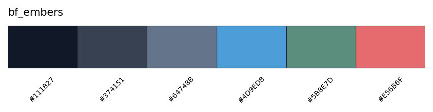
bf_embers | qualitative | cool ember-inspired Bits & Flames palette for quiet analytics figures | no |
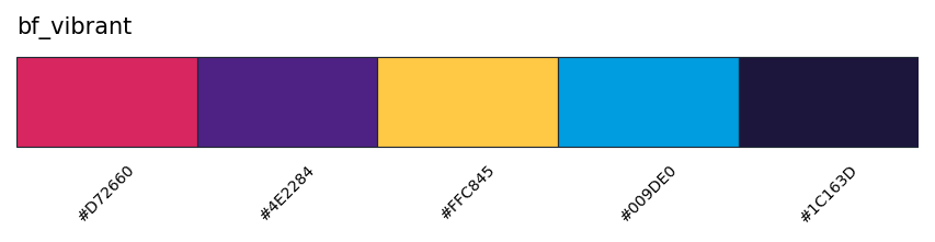
bf_vibrant | qualitative | high-contrast Bits & Flames palette for vibrant branded figures and presentation highlights | no |
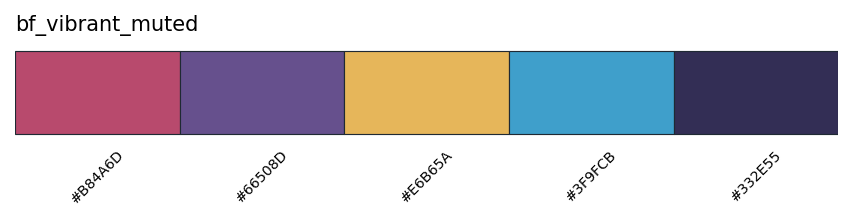
bf_vibrant_muted | qualitative | muted Bits & Flames vibrant palette for branded figures that need less saturation | no |
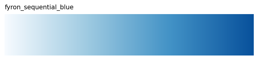
fyron_sequential_blue | sequential | ordered magnitude maps, density, risk scores, intensity summaries | yes |
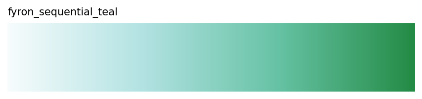
fyron_sequential_teal | sequential | ordered magnitude maps with a cooler visual tone | yes |
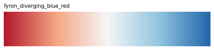
fyron_diverging_blue_red | diverging | correlations, residuals, and zero-centered difference maps | no |
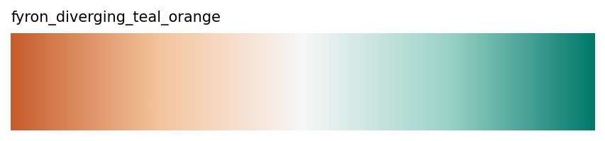
fyron_diverging_teal_orange | diverging | centered clinical quantities and signed changes | no |
Palette Overview
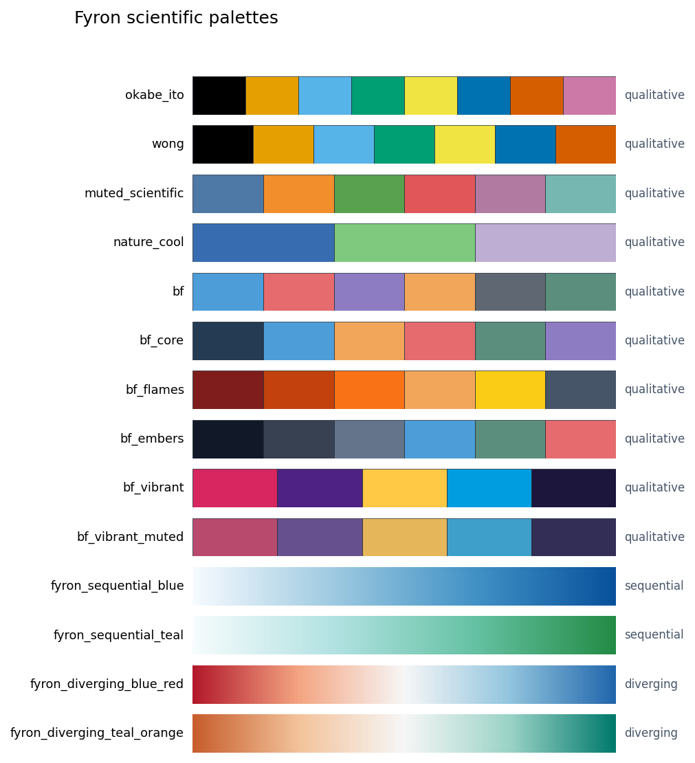
Palette Gallery
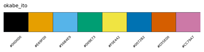
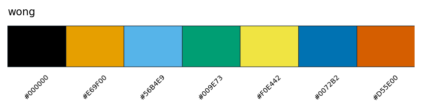
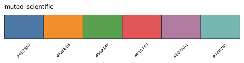
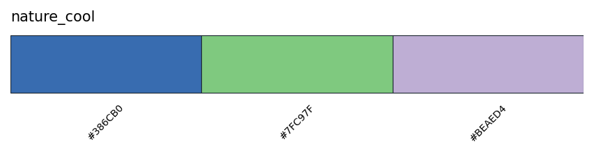
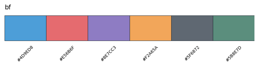
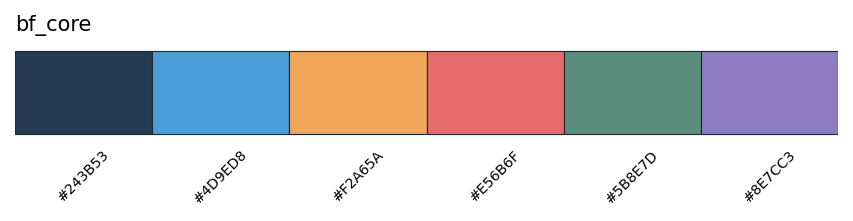
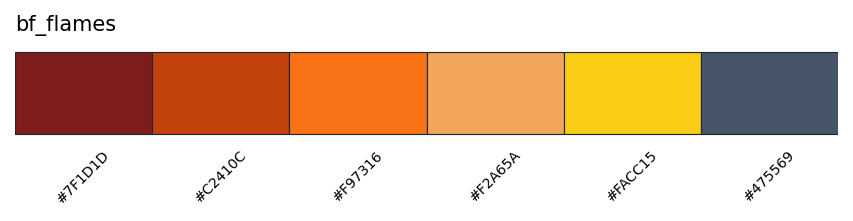
Reproducible Palette Audit
Use the API to generate the exact same previews in a notebook or paper-figure script:
from fyron import plotting as fp

palettes = fp.list_palettes()
fig, ax = fp.preview_palette("okabe_ito")

luminance = fp.palette_luminance_table("okabe_ito")
contrast = fp.palette_grayscale_contrast("okabe_ito")
list_palettes() returns the palette name, family, number of colors, maximum recommended categorical colors, colorblind-safe flag, source note, and explicit hex values.
Figure Style
fp.set_plot_style("paper", palette="okabe_ito")Use palette="bf", palette="bf_core", palette="bf_flames", palette="bf_embers", palette="bf_vibrant", or palette="bf_vibrant_muted" when brand continuity matters. For manuscripts, prefer okabe_ito plus hatches, markers, direct labels, and small multiples when there are many groups.
Checks Before Publication
- Preview the palette in the expected number of groups.
- Audit luminance when figures may be printed in grayscale.
- Use diverging colormaps only when zero or a midpoint has meaning.
- Avoid rainbow and jet palettes for scientific interpretation.
- Verify final exported figures in the target medium: PDF, SVG, slides, or grayscale print.